


Climate change and the environment: data stories to understand climate’s actual state
Part 3


Font: Drawing the Times
You can find part 1 here and part 2 here. In this installment you are bound to find a bit more mathematical stuff. I’m aware that it can be challenging to some, but don’t despair. You won’t need it to understand the results. This stuff is necessary only to communicate what type of computing was necessary to analyze the data (this is the reason the discipline is called computer science after all, we compute things).
Surface Air and Maritime Temperature
B. Analysis from the NOAA’s National Centers for Environmental Information (NCEI) dataset
Again, it was used R Programming to preprocess and summarize the data, with package maps to plot the charts. As the dataset recorded around 139 years, in which not only data gathering techniques changed but also the area covered, missing data was observed. Fortunately, NOAA provided an extended reconstructed sea surface temperature1 that provides a minimum coverage of 60%. To get a better understanding about current Earth’s climate, it was decided to plot the temperature data map for the data available in 2019. Figures 8, 9 and 10 represent global temperature anomalies observed during the year’s first quarter.


It is possible to observe an increasing area of warmer surface sea temperatures in the south hemisphere during the first two months, especially close to the pole. Knowing the period amounts for the hemisphere’s summer, the water on the south hemisphere’s coldest area presented temperature anomalies ranging from 4⁰C to 6⁰C warmer, a phenomenon not observed at regions closest to the planet’s equator. In March, a big surface air anomaly in Europe was observed. According to the Copernicus Program2 in its monthly climate bulletin3, March 2019 ties with March 2017 as the second warmest March on record in Europe4. Over the continent’s eastern part, the temperature was above normal by more than 3⁰C and in central Siberia, it is possible to observe temperature anomalies also ranging from 4⁰C to 6⁰C. Temperatures were also above average over Alaska, northwestern Canada and Australia. According to the Australian Government’s Bureau of Meteorology, it was the warmest March on record5 in the country.
Having the temperature’s “picture” in early 2019, it was decided to check if the results observed were sporadic anomalies or part of a broader trend. To determine the magnitudes of global warming, the characteristics of its spatial patterns and temporal variations can be used [11]; hence, it was chosen to compute the global area-weighted average (also called spatial average) from the entire monthly data available to proceed with the analysis.
The area-weighted average of a sphere is mathematically defined as:

Where T(ϕ, ϴ, t) is the temperature field, ϕ is the latitude, ϴ is the longitude and t is time. Since the data is stored in a grid 5 degree x 5 degree, the above formula has to be adapted to calculate the gridded latitude and longitude resolutions, 𝚫ϕ X 𝚫ϴ, as discrete variables. The formula is as follows:

Where (i, j) are coordinate indices for the grid box. 𝚫ϕ and 𝚫ϴ are latitude and longitude resolutions in radians and are calculated as 5 degree considering 𝚫ϕ = 𝚫ϴ = (5/180)𝜋. The global average was then calculated using the above formula as:
Due to the missing data problem cited earlier, one more data transformation was needed to avoid averaging the N/A (data-void) regions. We assigned a data box with weight proportional to cos(ϕij) and a data-void box with zero weight. Figure 11 shows the result.
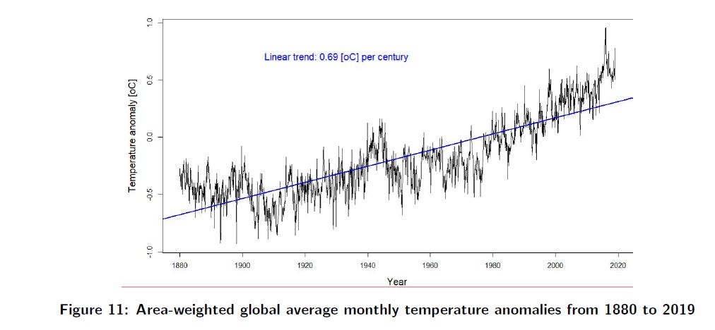
To facilitate the visualization, a linear regression based on IPCC’s variation rate of 0.69⁰C increase per century was added to the chart. It is possible to observe a variation consistently higher than the line trend since the beginning of the 21st Century. To a better view, it was charted an annualized version from Figure 11, as seen in Figure 12.

The drop observed by the end of the chart is due to the fact that the data available when this study was performed went only up to March 2019 (meaning that the remaining months received a zero value). Despite Figures 11 and 12 already have shown an increase in Global temperatures, this study still like to verify if the increase was uniform and which areas experienced warming and cooling.
It was decided to plot a map chart in order to visualize the spatial characteristics of temperature trends from the entire time series. Again, missing values required a computing strategy. This time it was opted to use regression imputation, in which the existing variables were used to make a prediction that is applied as a substitute, acting as an actual obtained value. However, if the sequence of the missing data did include the beginning and closing months (January and December) from a particular year, making it difficult to determine an yearly sequence, the trend for the box was not calculated, producing white areas on the chart (seen in Figure 13).

Considering the 139 years from the time period (1880-2019), the planet’s warming was non-uniform with great areas in Europe, Africa, Canada and Australia suffering the most. Nevertheless, is 139 years really an ideal time series to visualize Earth’s climate change? At the start of 1980, scientists within the U.S. government predicted that conclusive evidence of warming would only appear by the end of that decade [3]. In this sense, narrowing the timeframe of analysis seemed a more adequate approach. Figure 14 shows the map chart for a 40 years-period from 1979 to 2019.

The increase in red areas shown by Figure 14 corroborates the trend seen in Figure 12 from the year 2000 onward. The NOAA data does show a higher temperature trend in our planet. Since as early as February 1979, an international consensus had settled on curbing carbon emissions as the best solution [3] to handle the problem. Is that right? The next section tries to clear the matter by analyzing data concerning greenhouse gasses emissions (which, folks, I will not be able to share because it was not part of my work - but I will provide a few glimpses in the next and last installment, featuring a visual assessment of the charts selected to this data story and the conclusion).
REFERENCES
The reference section was listed in the first installment. Please, refer to the post for more information.
Earlier years had many missing data (i.e. 19th Century and first half of 20th Century) while recent years are better covered (i.e. second half of 20th Century and 21st Century).
The Copernicus Program is a European Union’s Earth observation program, coordinated and managed by the European Commission in partnership with the European Space Agency (ESA).
The bulletin can be accessed at https://climate.copernicus.eu/surface-air-temperature-march-2019
After March 2016, the record holder at the time of writing (2019).
The Australian Government summary can be accessed at http://www.bom.gov.au/climate/current/month/aus/archive/201903.summary.shtml