
Climate change and the environment: data stories to understand climate’s actual state
Part 2


Font: Freepik
You can find part 1 here.
As you will read below, we used two public datasets: one from the University of Dayton, Ohio, and the other from the National Oceanic and Atmospheric Administration, A.K.A. NOAA, a United States government agency. The NOAA’s dataset was created and maintained by NOAA’s National Centers for Environmental Information (NCEI), which, according to their Website, uses geophysical data from the Sun to Earth and the Earth's sea floor and solid earth environment, including Earth observations from space.
In this second installment, it will be presented the results and discussion from one of the two datasets analyzed for the study, the University of Dayton dataset.
Surface Air and Maritime Temperature
A. Analysis from the University of Dayton dataset
Surface temperature is an indicator of regional and global climate change, and represents the temperature of the air near the surface of the earth (air temperature) or the temperature of water close to the ocean’s surface (maritime temperature). A balance of various forms of solar and terrestrial radiation maintains the average surface temperature of Earth (1). The planet absorbs about 70% of the total solar radiation entering the atmosphere (1). As the remaining 30% reflected back to space by clouds, the atmosphere or reflective regions of Earth’s surface do not remain fixed over time due to variations of spatial extent and distribution of reflective formations (1), an “internal energy surplus” can warm-up the entire planet’s average temperature.
The analysis presented at this section used two different public datasets. One from the University of Dayton’s Average Daily Temperature Archive1, containing files of daily average temperatures for 157 U.S. and 167 international cities. The University updates the archive’s files on a regular basis, containing data from January 1, 1995 to present2. The other, from the National Oceanic and Atmospheric Administration (NOAA)3, a U.S. scientific agency within the United States Department of Commerce, whose studies are focused on the conditions of the atmosphere, oceans and major waterways. The dataset contains data merged into a monthly global surface temperature dating back from 1880 to the present4, updated monthly, in gridded (5 degree x 5 degree) and time series formats.
The University of Dayton’s dataset was tidy, preprocessed and applied in a visualization based on Edward Tufte’s chart (10) displayed at his “Visual Display of Quantitative Information” book. The original illustration is shown in Figure 1 and is known as “New York City Weather Chart”.
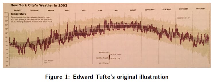
Tufte’s “New York City Weather Chart” was an annual review of the weather by The New York Times5. It shows daily high and low temperatures for 2003 and compares the year’s record hottest and coldest days to a time series data ranging from 1978 to 2003. The current study’s adaptation used R Programming packages dplyr and tidyr to preprocess and summarize the datasets (New York City and Rio de Janeiro) and ggplot2 package to plot the charts. The choice of New York City and Rio de Janeiro’s data to be analyzed is explained by comparable reasons. The original visualization concerns data from New York City, hence the necessity to compare updated data from the same location. This study would also like to explore the temperature variation in a tropical location; Rio de Janeiro was our option in this case.
We choose to analyze the years 2016, 2017 and 2018. The time series data ranged from January 1995 to December from the previous year and were used to produce two additional datasets containing the highest and lowest temperature for each day from the historical data. Then, it was created two dataframes6 to identify the days from the analyzed year in which the temperatures were higher and lower than all previous years. The New York City’s visualization set is shown from Figure 2 to 4 and Rio de Janeiro’s from Figure 5 to 7.
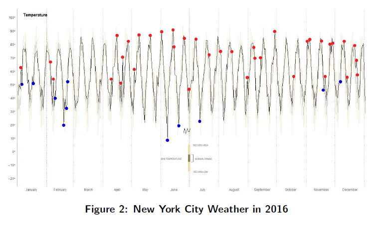
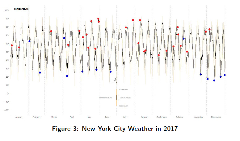


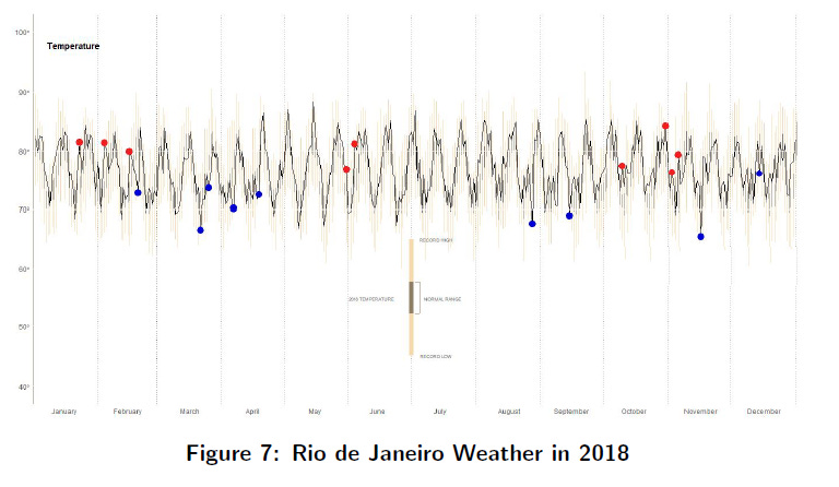
The temperatures are in Fahrenheit, the time series in light brown represents the historical data temperature records (max and min) from 1995 to the year before (e.g., for 2018, the historical range was from 1995 to 2017), while the dark brown represents the mean temperature for each day along with a 95% confidence interval for the analyzed year. The red and blue dots represent high and low temperature records during the year compared to the historical high and lows from 1995 to the year before.
Tufte signaled only one day with the historical record to the lowest temperature (in March) and another day with the hottest temperature (in November) for the entire year of 2003 in New York City. It means that the other ten months had temperatures around the normal range considering the historical rate (11 In Tufte’s case, the time series for historical rates runs from 1978 to 2002.) for both low and high temperatures. New York City’s weather from 2016 to 2018 was extreme, even considering a different historical rate (12 Our historical rate runs from 1995 to 2017.). It was thirty-seven days as the record hottest and eleven days as the record coldest in 2016; twenty-seven days as the record hottest and thirteen days as the record coldest in 2017; and twenty-two days as the record hottest and ten days as the record coldest in 2018. Despite the drop in these anomalous days, 2018 still presents a rate 16 times greater than 15 years earlier. Every month of the year had at least one day that surpassed the historical rate.
Rio de Janeiro, famous for its hot weather, had thirteen days as the record hottest and eight days as the record coldest in 2016; nine days as the record hottest and ten days as the record coldest in 2017; and nine days each as the record hottest and the record coldest in 2018. Although it can be observed a drop in the total number of anomalous days in this three-year period (21, 19 and 18 days respectively), 2018’s hottest day took place in October while its coldest day was registered in November, both during the south hemisphere’s spring. Rio de Janeiro’s tropical summer (that ran from late December 2017 to late March 2018) also had as many record highs as record lows (three days each).
Although Rio de Janeiro’s anomalous days represented around 5% of each year’s total number of days (while New York’s amounted for a range from 13% to 9%), this study decided to explore further temperature anomalies. The term temperature anomaly means a high variation from a reference value or a long-term average7. A positive anomaly indicates that the observed temperature was warmer than the reference value, while a negative anomaly indicates that the observed temperature was colder than the reference value. As NOAA’s dataset presents monthly global surface temperatures, it was decide to proceed with the analysis using its database (which will be shown in the next installment, stay tuned).
REFERENCES
The reference section was listed in the first installment. Please, refer to the post for more information.
It can be accessed at http://academic.udayton.edu/kissock/http/Weather/
The present study downloaded files with data from the cities of New York and Rio de Janeiro in early May 2019. The files contain data up to March 2019.
Zhang, H.-M., B. Huang, J. Lawrimore, M. Menne, Thomas M. Smith, NOAA Global Surface Temperature Dataset (NOAAGlobalTemp), Version 4.0 [NOAAGlobalTemp.gridded.v4.0.1.201903.asc]. NOAA National Centers for Environmental Information. doi:10.7289/V5FN144H [access date: 05/08/2019].
The dataset used by the present study contains data up to March 2019.
Information provided by Edward Tufte at https://www.edwardtufte.com/bboard/q-and-a-fetchmsg?msg id=00014g
A dataframe is a list of vectors, factors, and/or matrices all having the same length (e.g. number of rows).
This study used IPCC’s variation rate of + 0.69C per century.